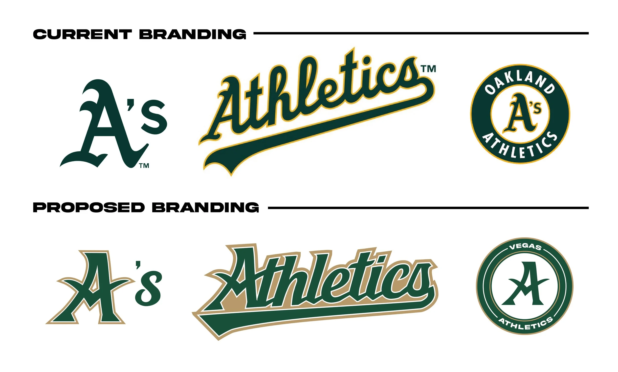
Vegas Athletics Rebrand
The Oakland Athletics have finalized a decision to move to Las Vegas in 2028. This calls for a rebrand. The Athletics have a very rich history and to keep some of that with the organization was important. This rebrand shows a new logo, wordmark, emblem, and colors creating a fresh and modern feel while also keeping it similar enough that it does not lose its history.


What’s New?
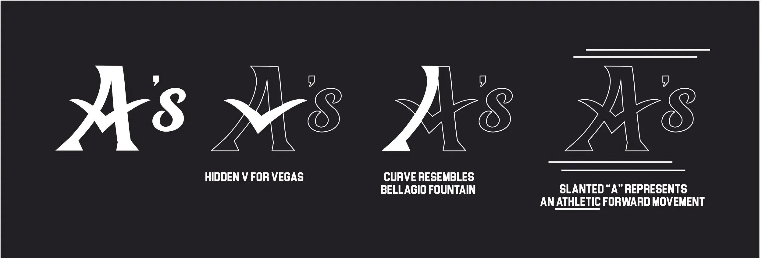
My proposed branding keeps many of the similar feelings of the current branding, while also refreshing the organization for a new look. The new logos and typeface have a more jagged and precise feel creating a sense of strength and focus. There is a slight forward slant on each of these marks, creating momentum and forward progress. The green has been brightened up, and the gold has been changed from a yellow, to a Vegas gold. This modern and sleek feel keeps the history of the Athletics organization while also providing energy to a bright future in Las Vegas.