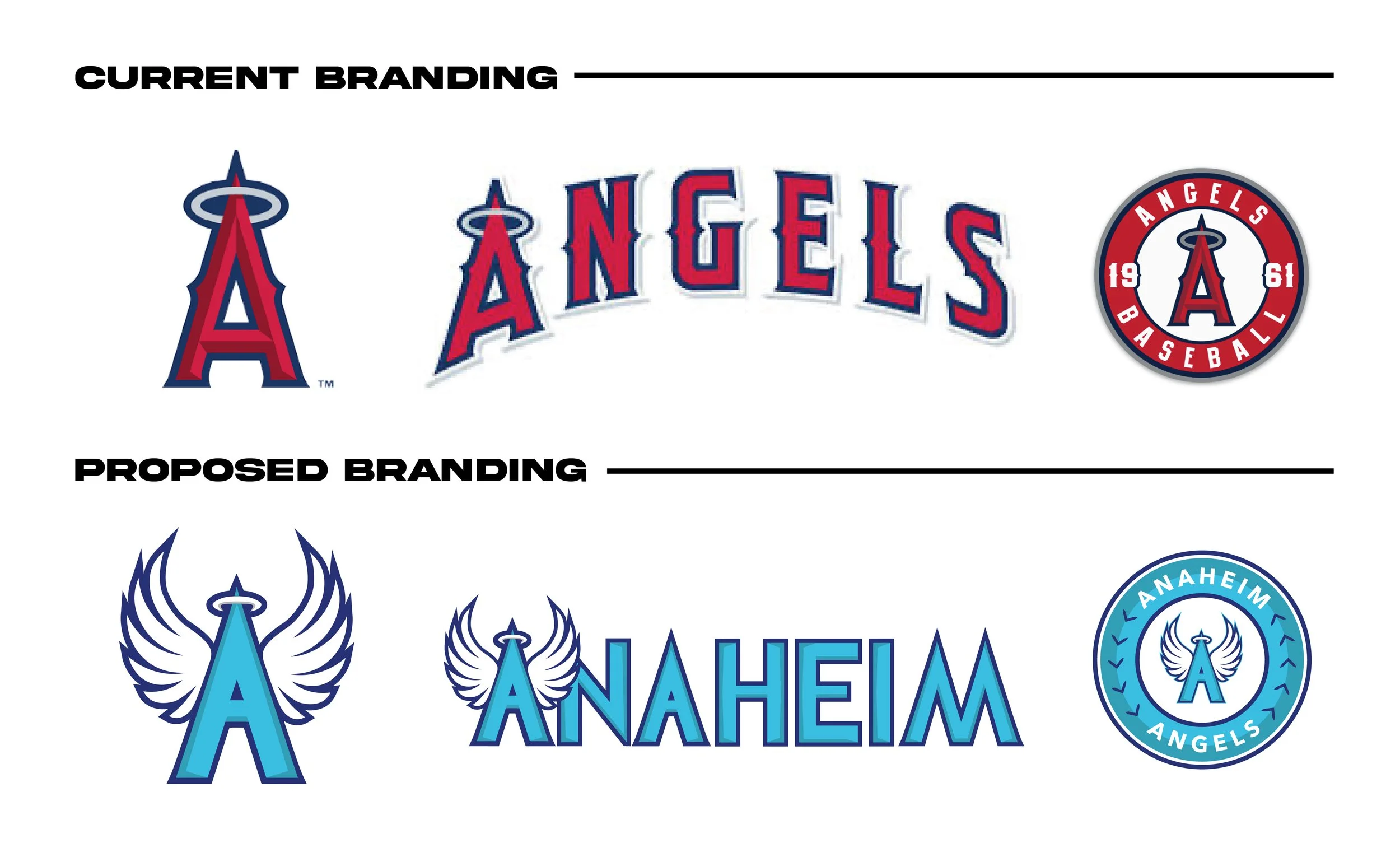
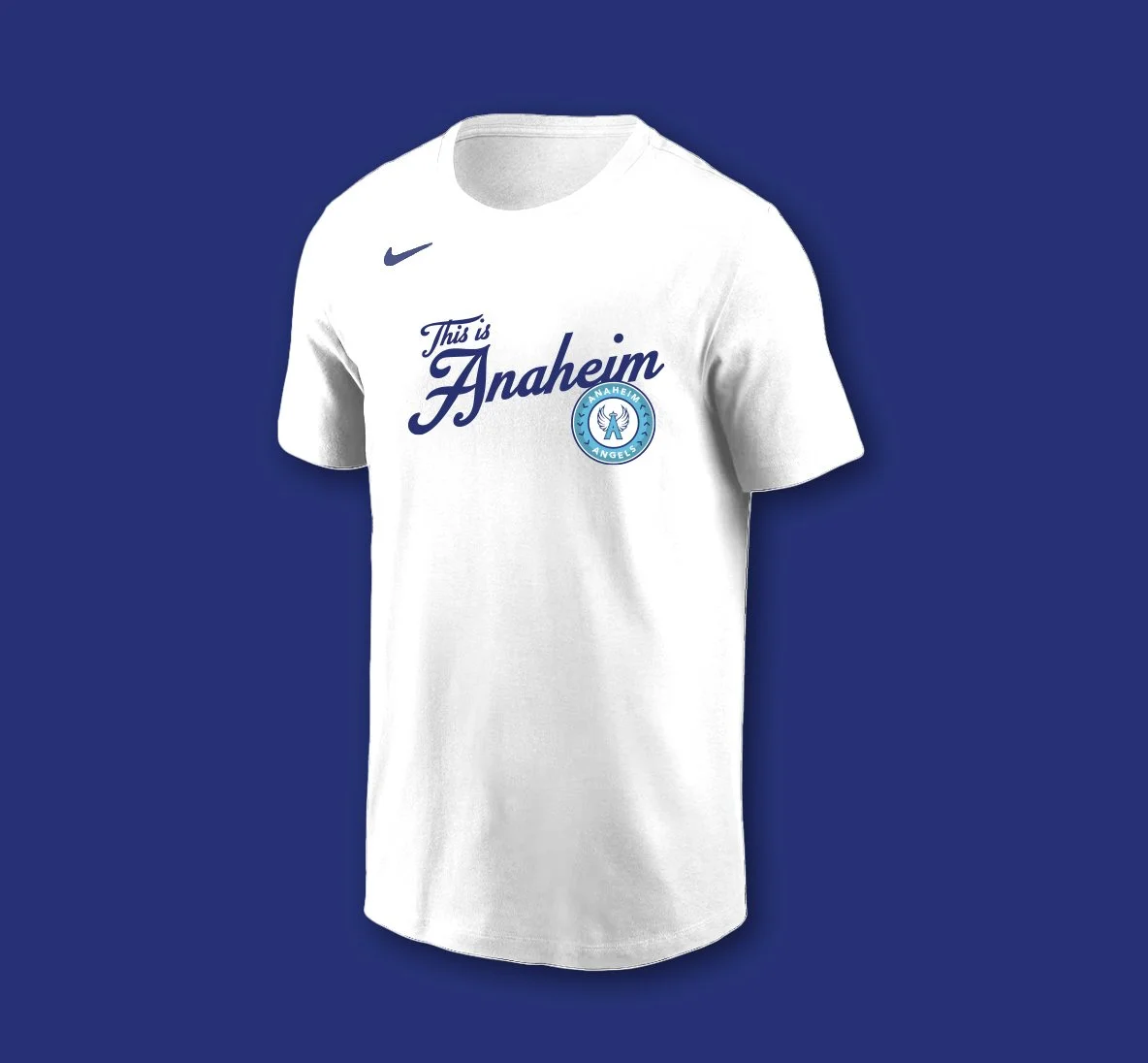
Anaheim Angels Rebrand
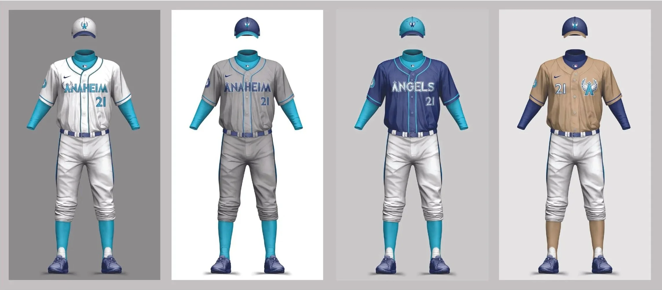
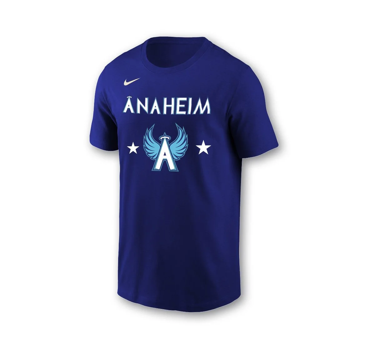
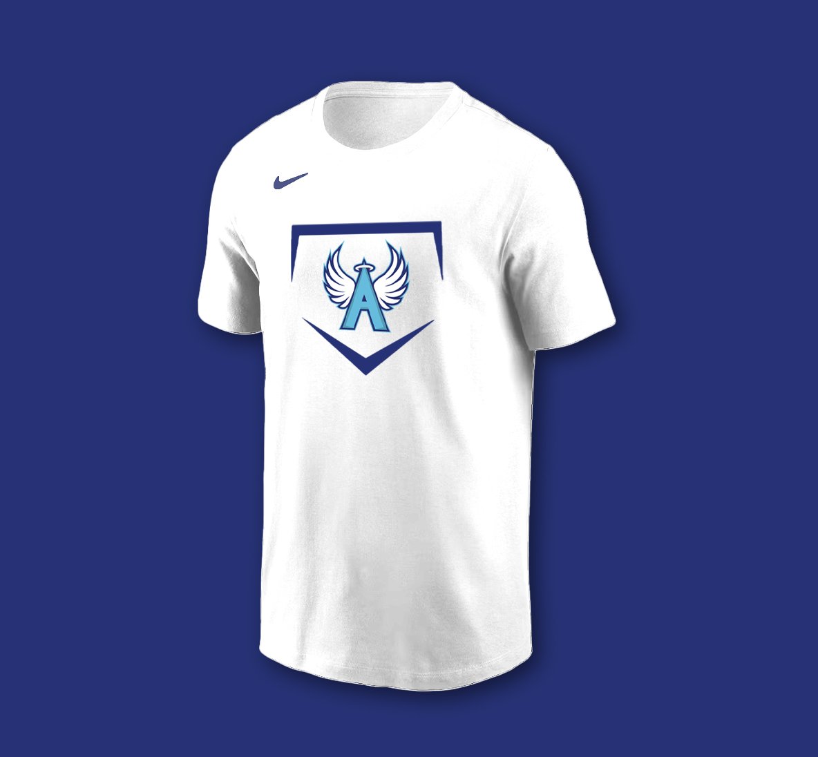
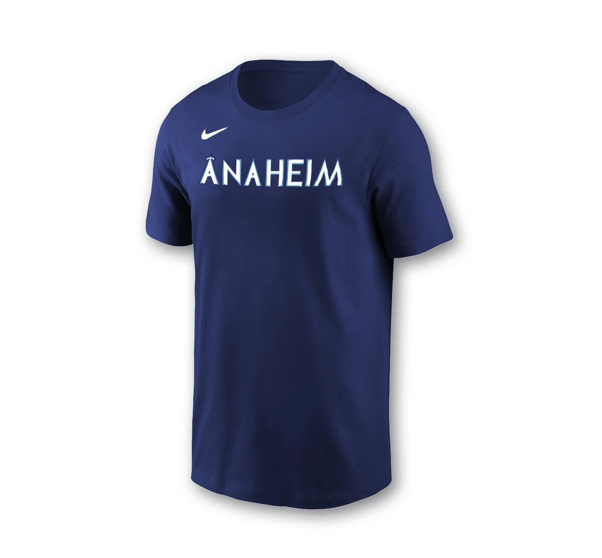
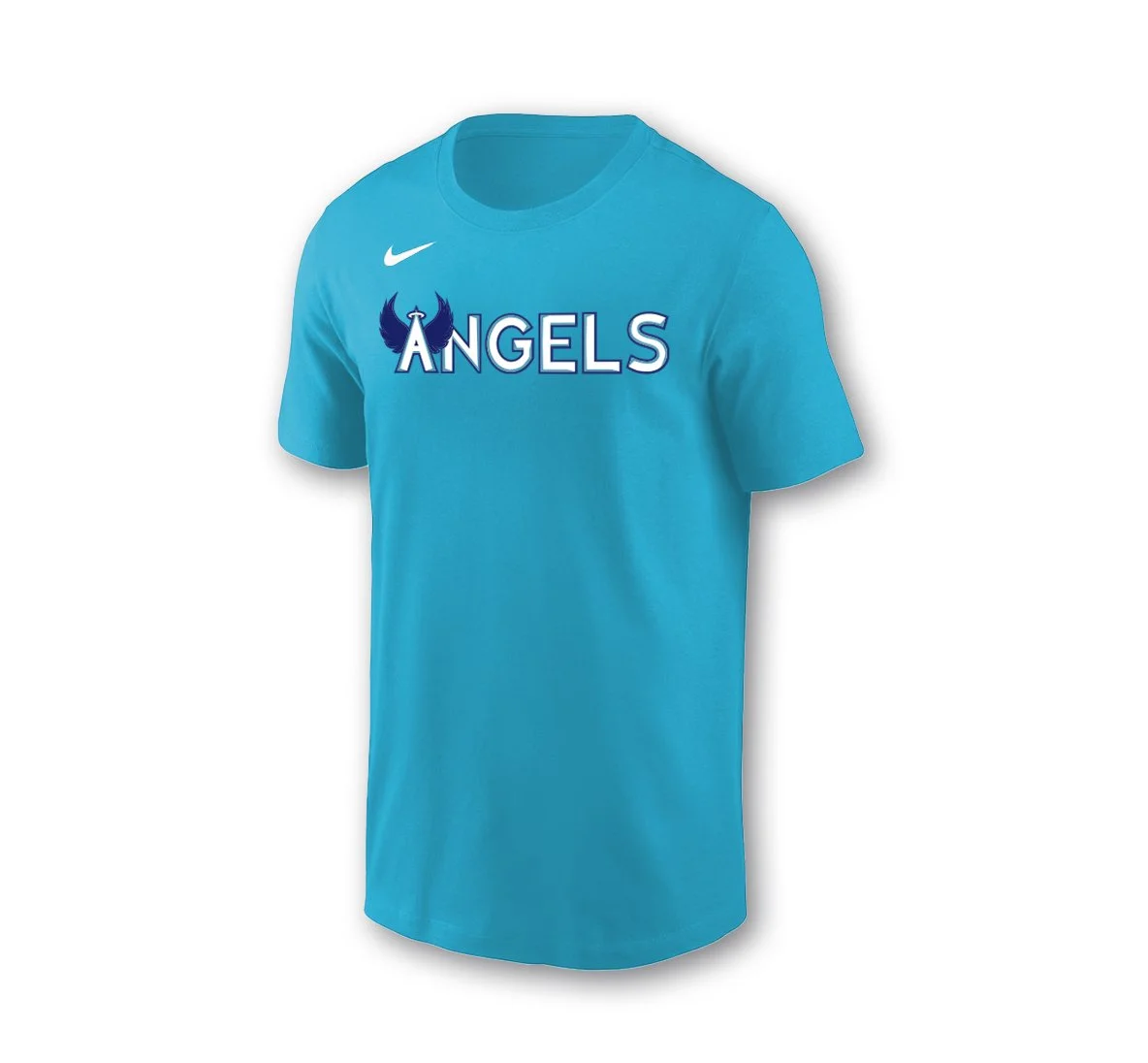
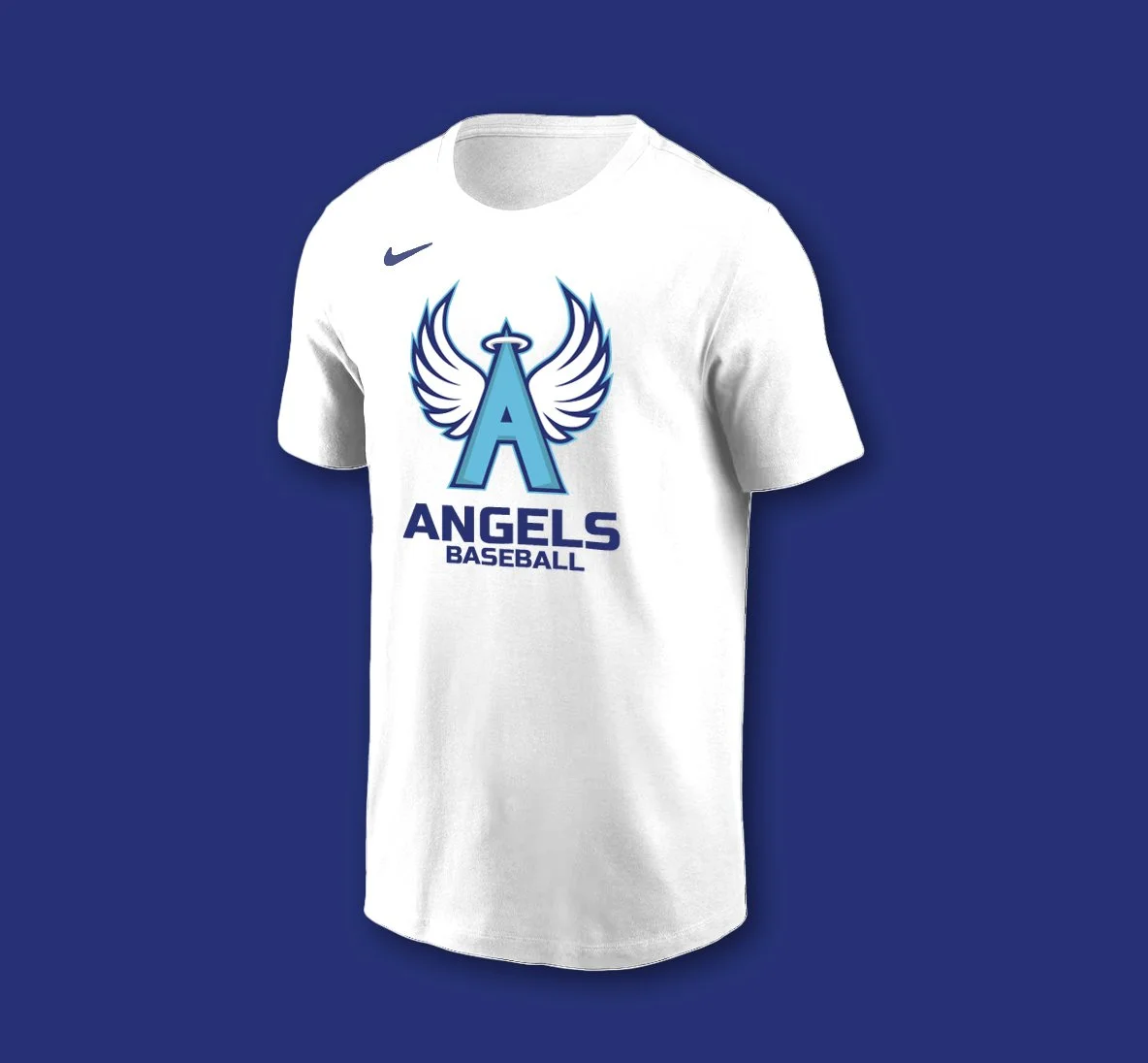
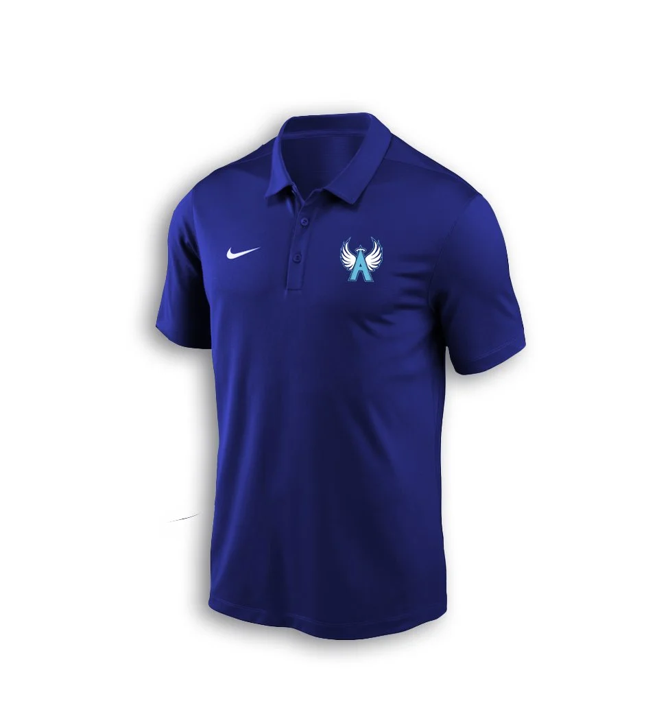
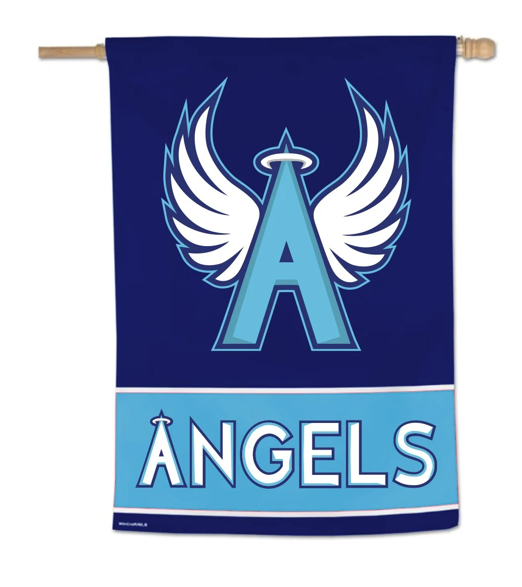
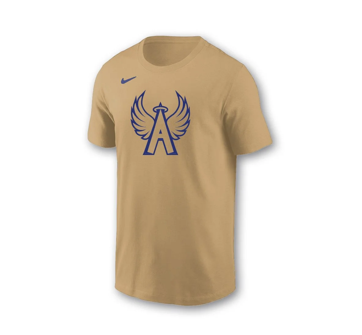
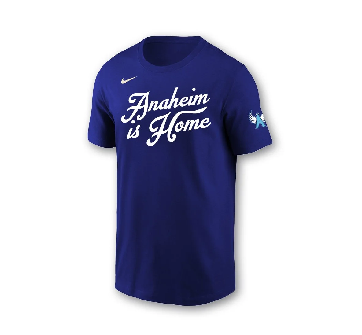
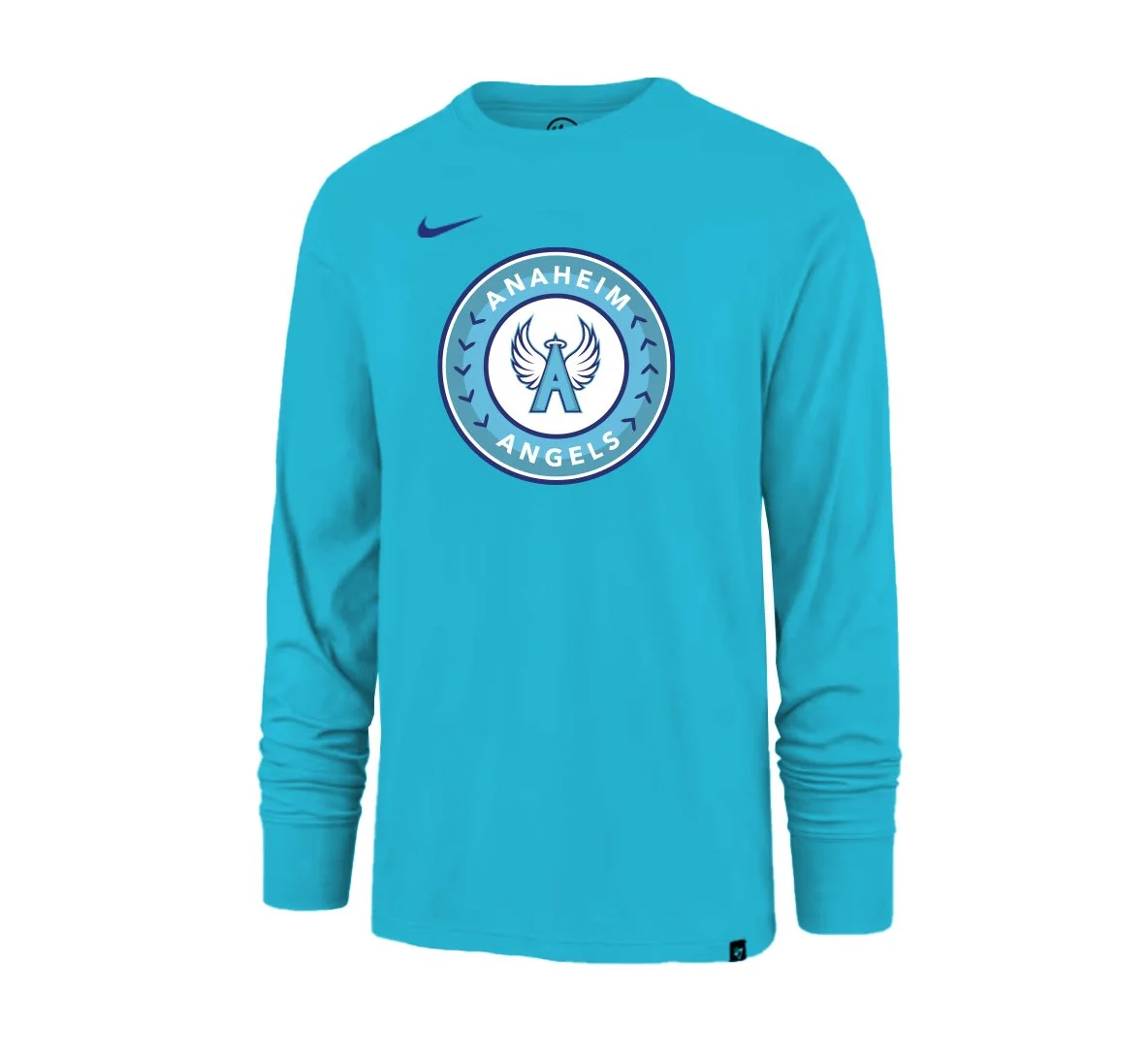
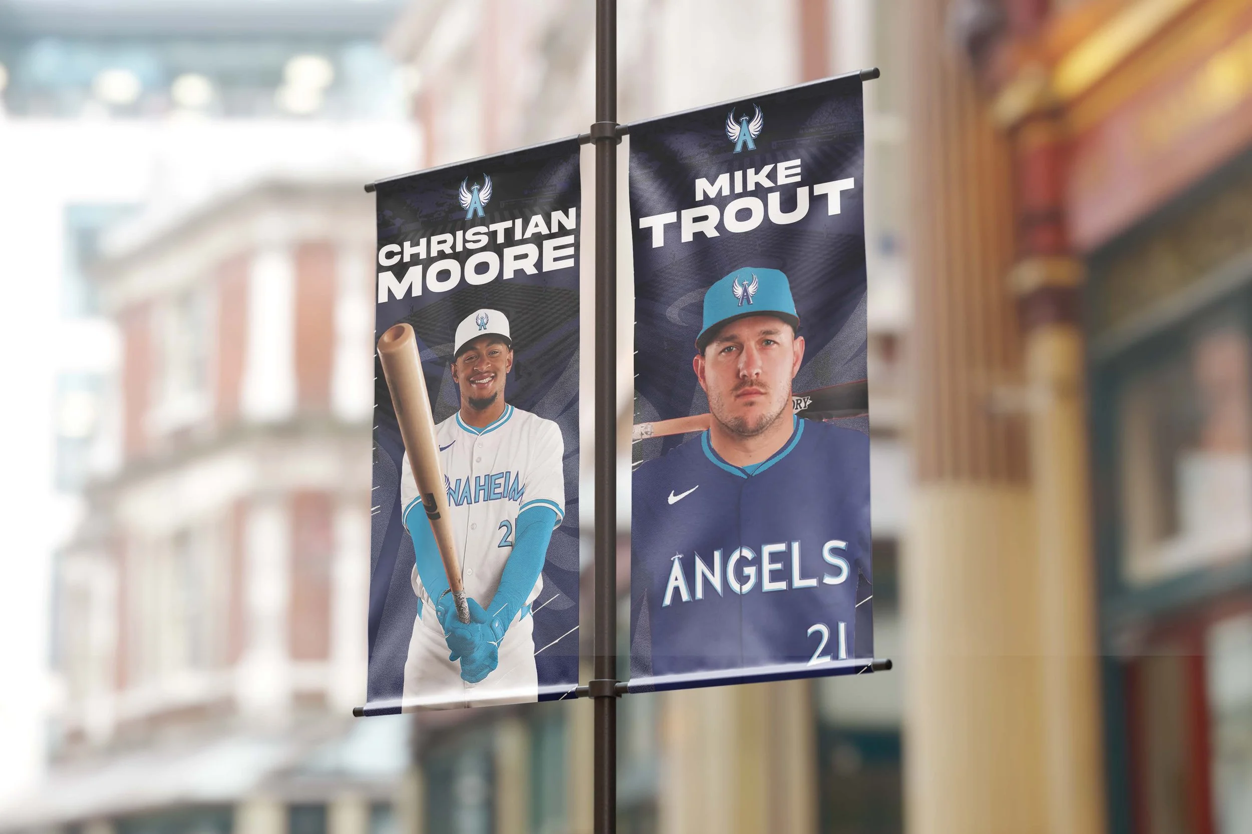
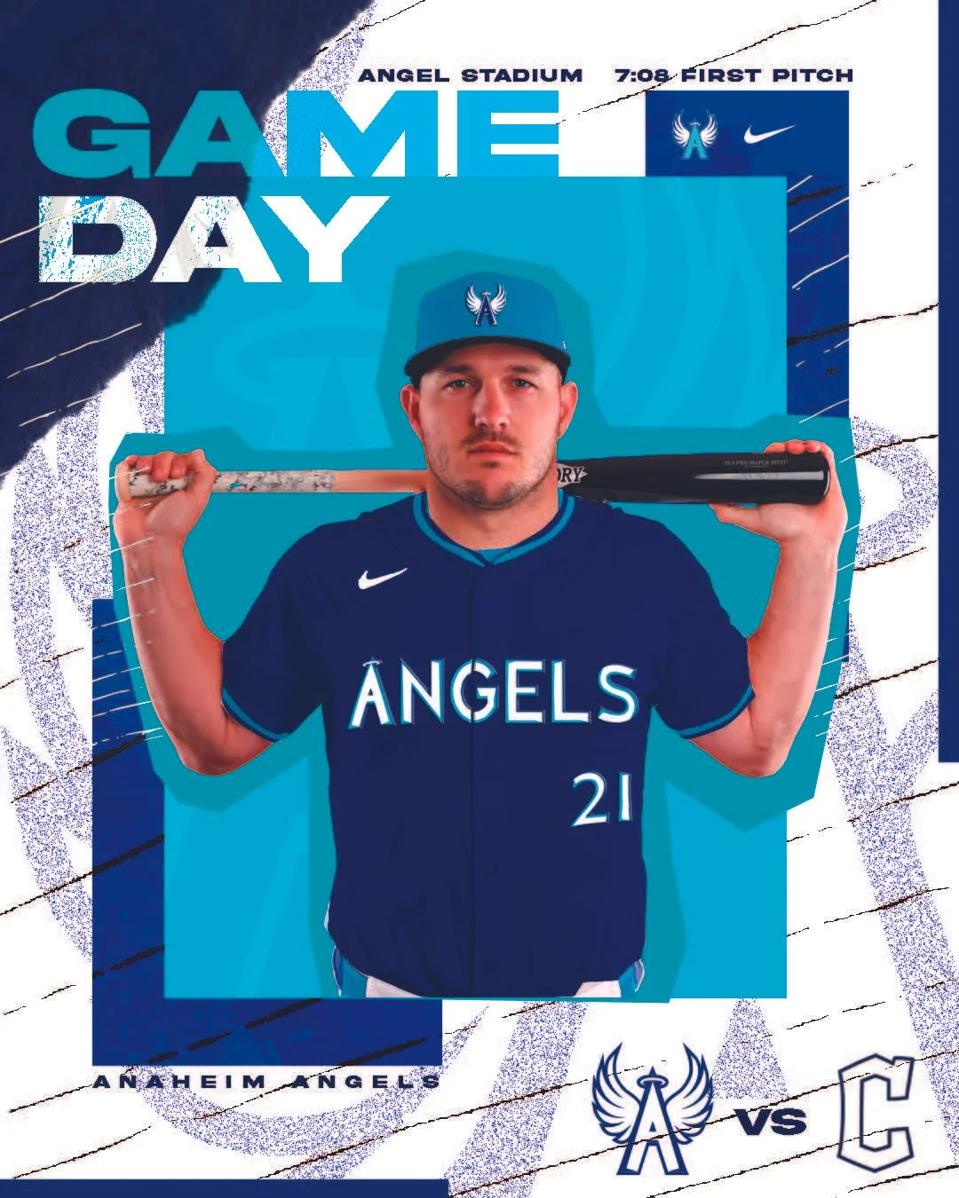
The Anaheim Angels is a rebrand concept for the current Los Angeles Angels. This concept helps to further the identity and mascot presence through the reworked logo mark which displays wings, a fresh set of colors that feels Angelic, and a move back to Anaheim that connects back to the rich history of this organization.


WhY REBRAND?
There are a few main reasons a rebrand makes sense. First, there is already a baseball team that is thriving in Los Angeles, the Dodgers. Second, nothing about red makes a direct connection to Angels, or the feeling of angelic. Lastly, there is a disconnect between the name “Angels” and the design identity, having no wings or anything symbolic besides a halo.
The updated color palette further supports this direction. These colors evoke qualities commonly associated with angelic imagery, such as clarity, calmness, and elevation, while also drawing inspiration from the Anaheim city flag. This approach not only strengthens the theme and consistency but also ties the brand more closely to its geographic context.